-
Colors psychology in marketing
In marketing content, the color is the key of your targeted public’s sensitivity.
It is what your audience get to see… what you want them to see, to feel or to do.
That’s why the understanding of the colors’ psychology in the marketing content is crucial for your content’s success.
Those wrong or superficial picked-up colors may negatively change the impact of your message. A great content and a very well integrated call to action may easily be ignored while the chromatic is wrong integrated.
The understanding of colors is not just for those artists that are daily using pigments. Anybody is working with a marketing content has to understand the basics of colors’ theory because the colors will be part of that content.
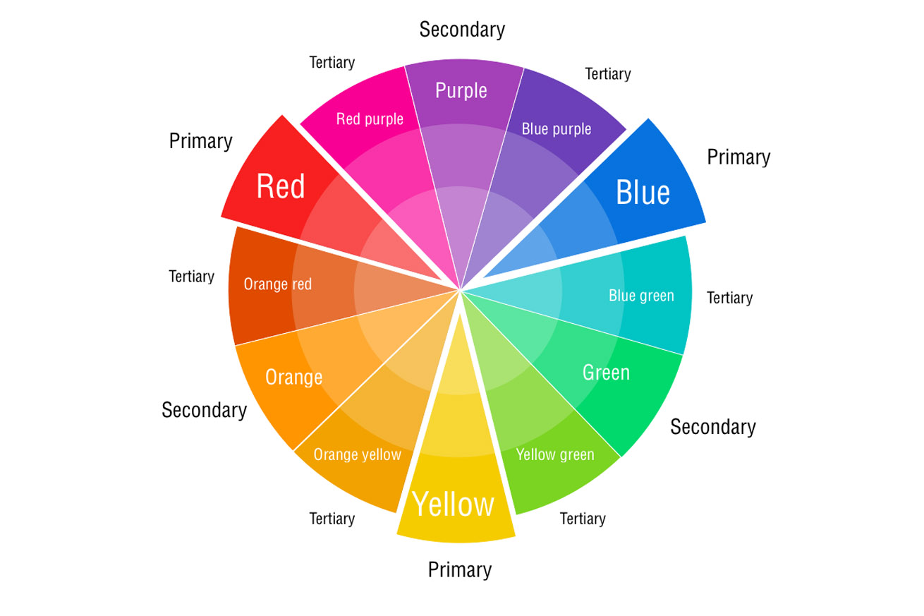
Primary colors are those 3 colors (red, blue and yellow). These are giving the other colors, that are named secondary colors.
The exceptions are coming when we’re talking about primary colors linked to the light – then the primary colors will be: cyan, magenta and yellow. Let's not forget about CMYK for print and RGB for screens and monitors. But, let’s stick to a simple note and take into account only red, blue and yellow.
Secondary colors are purple, green and orange. They are created using the primary colors. Looking at the colors’ pallet, you’ll see that in between the primary colors there are the secondary colors.
red + blue = purple
blue + yellow = green
red + yellow = orange
Tertiary colors are those who take one step further the secondary colors. They have “two-name” as: red-purple, red-orange, yellow-green etc. They are created through the adding of a bigger quantity from the primary color. The obtained color is this way closer to the primary color, rather than to the secondary color.
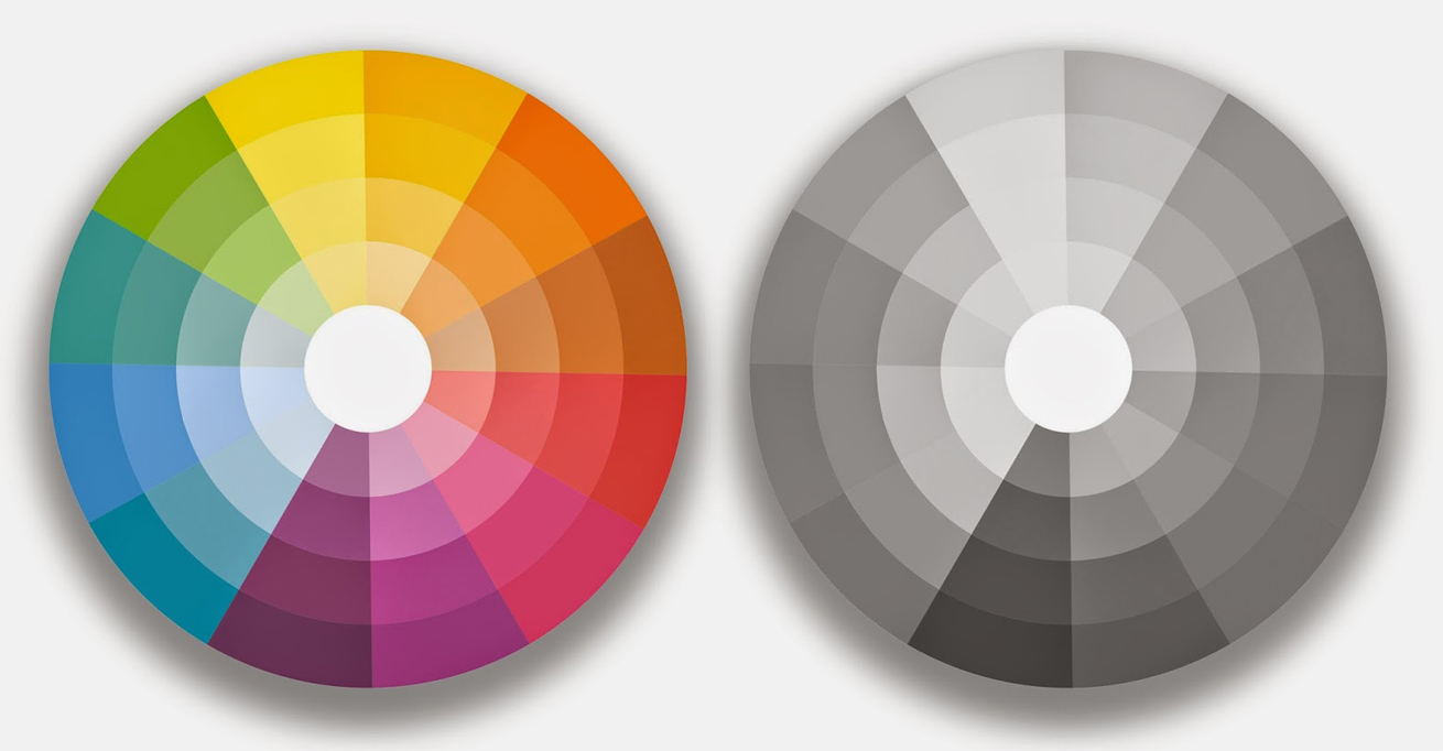
Pure colors are those primary, secondary and tertiary, without adding white, black or a third color at all. They are pure colors, saturated, intense, bright and untainted. They are specific for our kinds and babies toys and summer clothes.
Tints – are formed adding white to a pure color. They are also told pastel colors, as they are more bright and pale, in comparison with those pure colors and are not too intense.
Shadowes – are formed when there is added black into a pure color.
Tones – are resulting from a grey (white + black) with a pure color. You can easily play with the intensity level of a pure color.
The complete color pallet is formed by primary, secondary and tertiary colors, plus their tints, shadows and tones. It’s nice seeing them into a pallet, no?

How can we correctly use a contrast
When speaking about the colors technique, the contrasts are important in a special way. The contrast refer to how do you see a color over another color, and everybody faces this issue while trying to add a text or a distinctive object over a background.
Usually people assume that a contrast is given by different colors, which is not true. You can have two colors that are completely different, without any contract because their tones are similar.
Good to know!
For testing the contrast of the colors you’ve chosen, put them into “gray scale” and you will se how they contrast.

The designers prefer most of the time using the low contrast technique, not too powerful. They try to find the balance between a beautiful color scheme and the readiness of the content.
Good to know!
Choose the colors and contrasts that are easy to be readable. A hard to read content is failed. People opt for the simplicity; they prefer an easy to get through content, without being needed to find too many colors in there. More than that, the colors have meant, so each of the colors may take or add charge to your message.
Use complementary colors (opposite colors)
They somehow create a visual tension because they are opposite one to each other. The complementary colors attract! When the human eye sees for a long time the same color, he feels the need to see the opposite – for a visual break. Using the complementary colors is the easiest way to make content to stand-up.
Attention! Avoid combining the two complementary colors in equal proportions, because this way none of them is a winner and somehow, this stresses the eye.
Good to know!
Choose a primary color as being the principal color and then emphasize it with one of its complementary colors let’s say in a proportion of 7/3.
Using analogous colors
Analogous colors sit one next to each other on the color scale. It forms a “family of colors”, which creates a relaxed visual. These colors may create beautiful and subtle content, but you still need to add a complementary color to highlight a text or an item.
Using monochrome colors
Most of the specialists choose to use monochrome colors, in a combination with a complementary color.
The meaning of colors in marketing
Red – is common for stoplights, Valentine’s Day and horror movies. If you want to make a powerful presence to somebody or to quickly obtain someone’s attention, use red. Not too much, to avoid any negative reactions easily awaken.
Orange – is a common color for fruits, sporting events and boarding games. It is known to be a motivational color that brings you positive attention and general enthusiasm for life.
Yellow – often met at the traffic crossing, signs and smile faces. Not to much to be used, yellow helps at the increasing of the confidence and lifts someone’s spirit. Otherwise, it may cause self-esteem problems, fear or anxiety.
Green – we correlate it with the nature, the economic exchanges, restaurants and health based shops. It is the color representative for life and peace.
Blue – is s common color for hospitals, workout facilities and spa. It is a representative color for trust and responsibility. However, it may be perceived as a cold color, distant and unfriendly. Anyway, it may be a color easy to be agreed, very useful when it comes about building relationships, in special in the marketing area.
Purple – most of the times we meet this color in those magic shows, in fairytales and luxury products. Although it is a intriguing color, it give space to mystery and new ideas. That’s why the creativity is associated to the purple color.
Pink – common for the little children and babies objects. It is the color of hope, empathy and sensitiveness. Too much pink may be interpreted as immature, so be careful with the proportions. J
Brown – most of the times it is met in the furniture and coffee shops. It is a very serious color, probably the most stimulant color. It is interpreted as being a protection, structure and possession color.
There are more to be said about how, when, how much and why we need to use colors in marketing. But for the beginning it’s great we have the chance to consolidate our based knowledge when it comes about colors.
And the last Good to know! from this article:
Test, before deciding what color to choose. You cannot know how is your audience going to respond to the used colors, only if you test them in order to be able to determine before what colors’ combination generate the highest traffic.

